Thingmajig
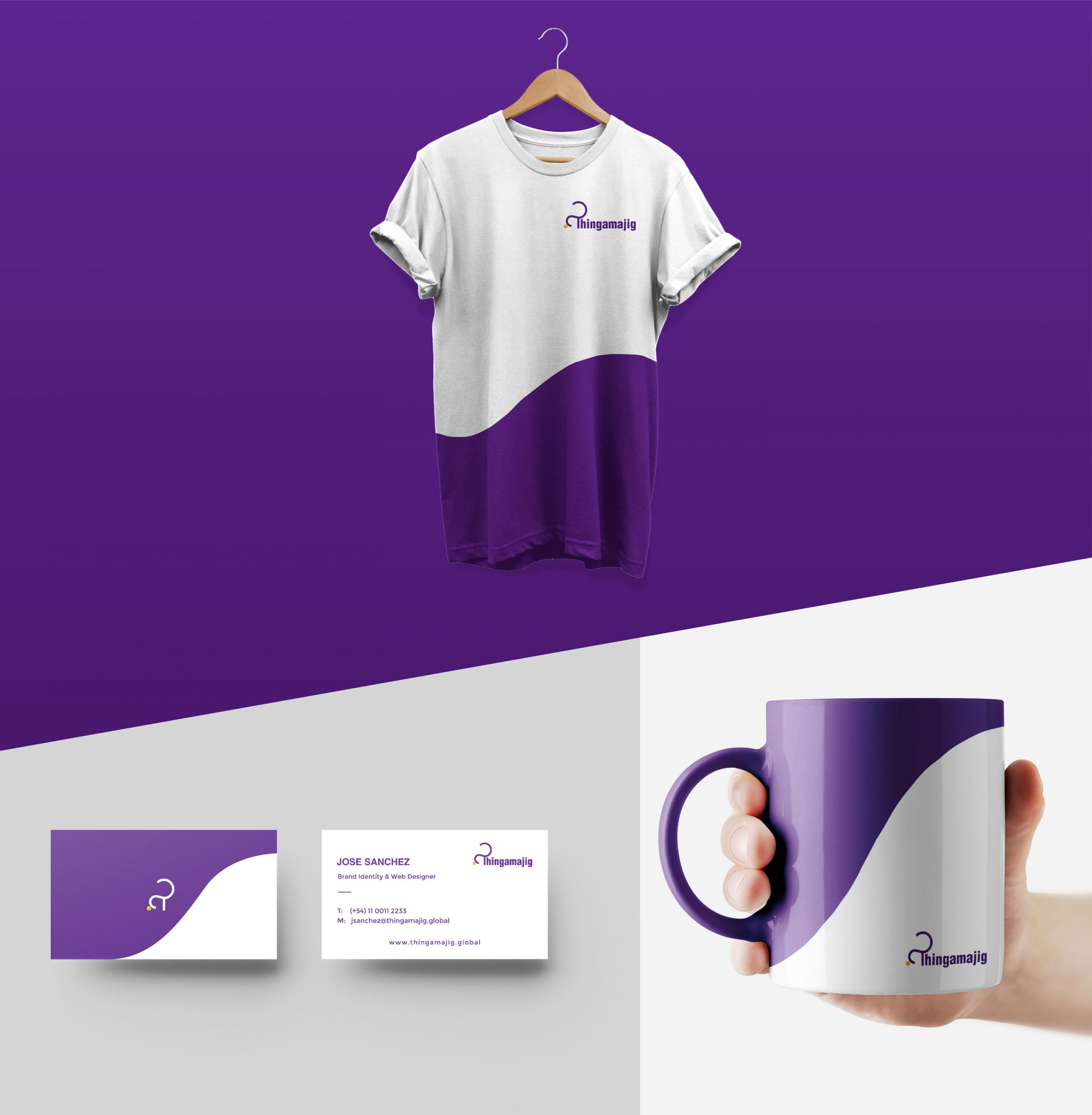
Building the brand identity for our own agency.
Here we've learned that designing for one self is harder than we thought.

© Thingamajig Named after the English word with the same name. First appearing in 1824. Erm we mean the word, not our business. We as a business are much younger and more youthful than that.
The definition of the word in question is "something that is hard to classify or whose name is unknown." And indeed we are, an unknown, unclassified and unstoppable Digital Design Consultancy providing expertise under an array of fields to provide you with the best digital experience for your business.
WHERE DID ALL CAME FROM?
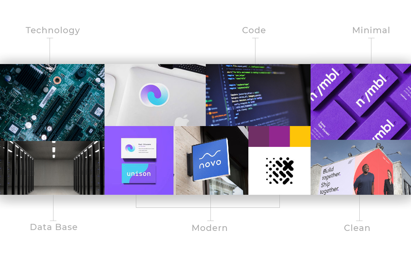
KEY CONCPETS

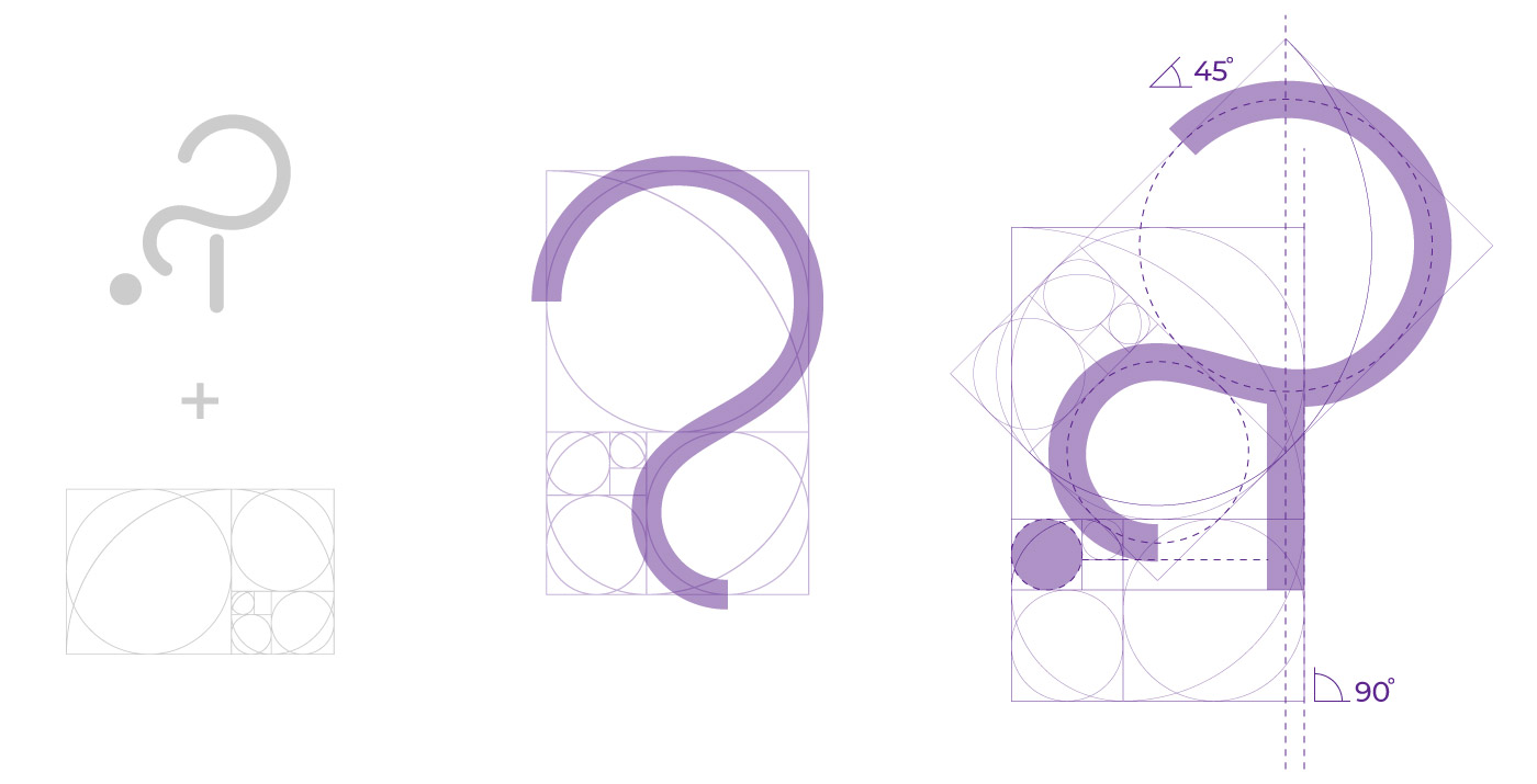
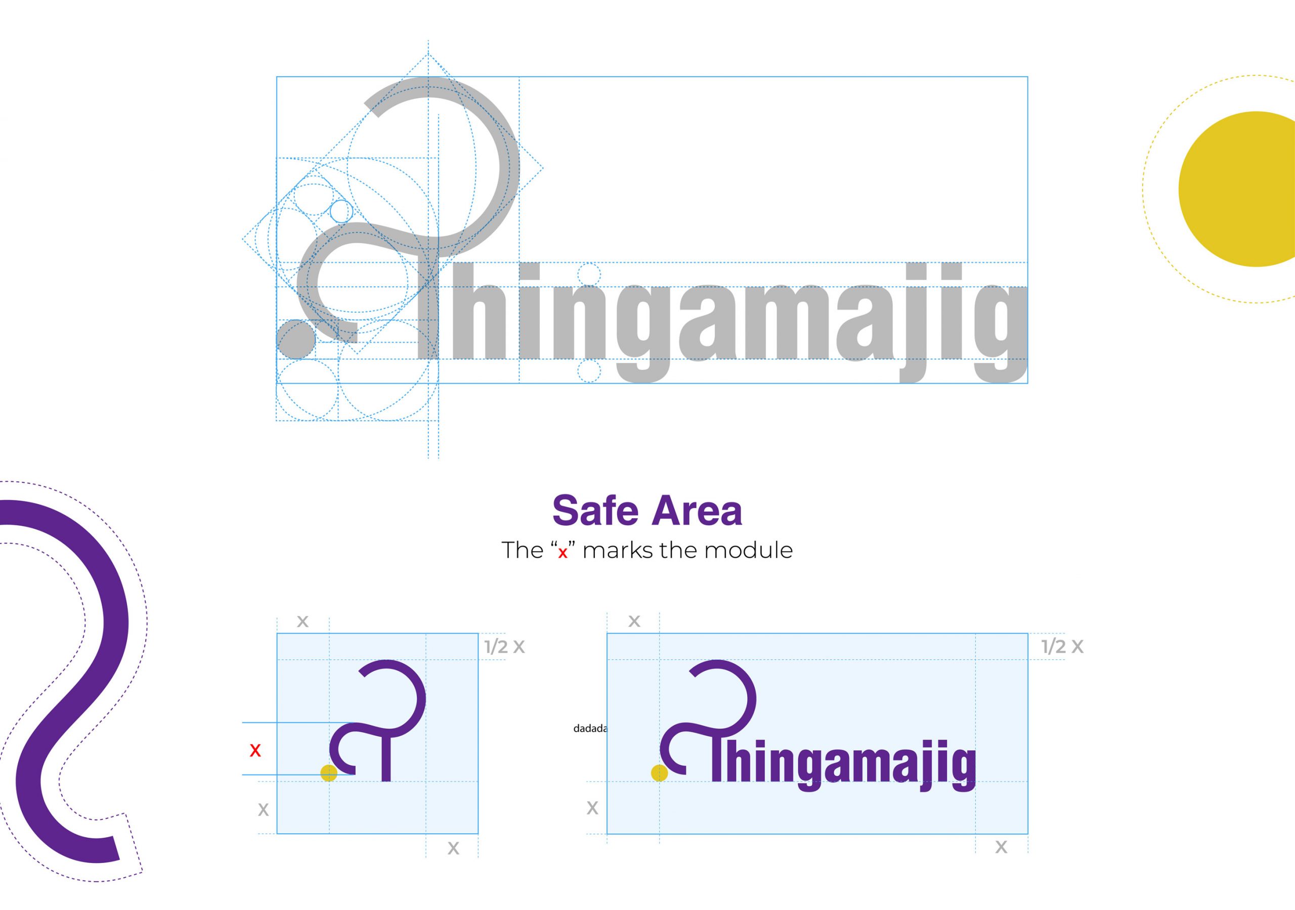
The main challenge with Thingamajig was to blend all the fields of work and the definition of its name into a single icon that still has to be minimal, friendly and modern.
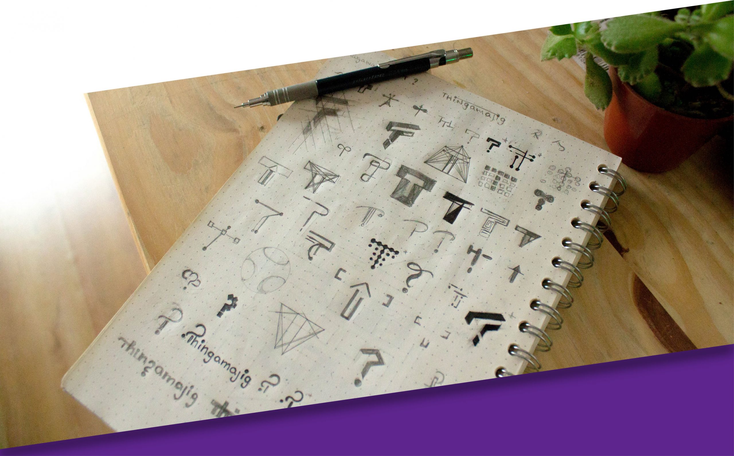

ICON DEVELOPMENT
Then the rounded ends of the main concept were brought into a more defined and rectangular shape, this helped to create a contrast between the organic movement of the curve and the solid and modern style of the brand itself.
